Design assets
During the software development process, your team will often have various design assets (Figma, markdown, or image files) associated with each component.
The design extensions of
component-controls allow you to organize such assets and keep them alongside the actual component.You can find an example design page that demonstrates associating a design brief(description), Figma, and Markdown files with a
VariantButton component.There are several plugins in
component-controls to help with design assets:- Figma files with '@component-controls/figma-embed'
- Markdown files with '@component-controls/addon-notes'
- Image files with '@component-controls/addon-images'
All the plugins contain a "block" that can be incorporated in a page, as well as a standalone "page" component.
The easiest way to start incorporating design assets in your documentation site is by adding a
DesignPage to your sites's configuration.config/buildtime.js
module.exports = {...pages: {story: {tabs: {page: '@component-controls/pages/ClassicPage',test: '@component-controls/pages/TestingPage',design: '@component-controls/pages/DesignPage',},},},};
The
DesignPage tab will only be visible once you add some design assets associated with the current document(file) or individual storyThe design plugins can be configured in the
plugins section of a document or a story. All the design plugins support an array of asset items.Button.stories.tsx
import { Document } from '@component-controls/core';import design_notes from './design-assets/design-notes.md';;import design_img from './design-assets/design-img.jpg';export default {title: 'Button',component: Button,plugins: {figma: ['https://www.figma.com/file/vgf0guEmC5IKtjHJKkRVSr/Button?node-id=0%3A1',],notes: {// using an object consisting of global configuration props (ie title) and itemstitle: 'Design brief',items: [design_notes],},images: [design_img],},} as Document;
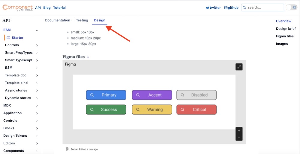
At this point you should see the Design page tab and the design assets that you have associated with the document:
 DesignPage
You can associate Figma files such as wireframes or full-color designs to your components documentation files
The Figma file will be assigned to all the stories in the current document
mystory.stories.tsx
import { Document } from '@component-controls/core';export default {title: 'MyStory',plugins: {figma: ['https://www.figma.com/file/vgf0guEmC5IKtjHJKkRVSr/Button?node-id=0%3A1',],},} as Document;
The Figma file will be assigned only to a specific story. This allows multiple stories in the document to have different Figma files associated with them.
mystory.stories.tsx
import React from 'react';import { Document, Example, ControlTypes } from '@component-controls/core';import { Button, ButtonProps } from './Button';export default {title: 'MyStory',} as Document;export const story: Example<ButtonProps> = () => <Button>click me</Button>;story.design = plugins: {figma: [{title: 'My Figma files',url: 'https://www.figma.com/file/vgf0guEmC5IKtjHJKkRVSr/Button?node-id=0%3A1',}],};
mystory.mdx
---title: MyStory---import { FigmaEmbedBlock } from '@component-controls/figma-plugin';<FigmaEmbedBlockitems={[{url:'https://www.figma.com/file/hS1sLjYq49vjnKXhwGgHwg/Navigation-UI-design-components-Community?node-id=1%3A2309',},{url:'https://www.figma.com/file/LtgbR2mbVPbQTNDfDQxbKL/Atanas-Stoyanov-s-Team-Colors?node-id=0%3A1',},]}/>
You can globally change the iframe options for the FigmaEmbedBlock component
.config/runtime.tsx
import { RuntimeConfiguration } from '@component-controls/core';const config: RuntimeConfiguration = {...components: {'figma-embed': {width: '200'}},};export default config;
You can associate markdown files such as design briefs/outlines to your components documentation files
The notes will be assigned to all the stories in the current document
mystory.stories.tsx
import { Document } from '@component-controls/core';import design_notes from './design-assets/design-notes.md';;export default {title: 'MyStory',plugins: {notes: {title: 'Design brief',items: [design_notes],},},} as Document;
The notes will be assigned only to a specific story. This allows multiple stories in the document to have different notes associated with them.
mystory.stories.tsx
import React from 'react';import { Document, Example } from '@component-controls/core';export default {title: 'MyStory',} as Document;export const story: Example = () => <Button>click me</Button>;story.design = {plugins: {notes: [`# Introductionsome **markdown**`],},};
mystory.mdx
---title: MyStory---import { NotesBlock } from '@component-controls/addon-notes';<NotesBlockitems={[`# Introductionsome **markdown**`]}/>
You can globally change the default options of the NotesBlock component
.config/runtime.tsx
import { RuntimeConfiguration } from "@component-controls/core";const config: RuntimeConfiguration = {...components: {notes: {title: 'Design files'}},};export default config;
You can associate images such as screenshots to your components documentation files
The images will be assigned to all the stories in the current document
mystory.stories.tsx
import { Document } from '@component-controls/core';import main_screen from './media/main-screen.jpg';export default {title: 'MyStory',plugins: {images: {title: 'Screen design',items: [main_screen],},},} as Document;
The images will be assigned only to a specific story. This allows multiple stories in the document to have different images associated with them.
mystory.stories.tsx
import React from 'react';import { Document, Example } from '@component-controls/core';import main_screen from './media/main-screen.jpg';export default {title: 'MyStory',} as Document;export const story: Example = () => <Button>click me</Button>;story.design = {plugins: {images: [main_screen],},};
mystory.mdx
---title: MyStory---import { ImagesBlock } from '@component-controls/addon-images';import login_screen from './media/login-screen.jpg';import logout_screen from './media/logout-screen.jpg';<ImagesBlock items={[login_screen, logout_screen]} />
You can globally change the default options of the NotesBlock component
.config/runtime.tsx
import { RuntimeConfiguration } from '@component-controls/core';const config: RuntimeConfiguration = {...components: {images: {title: 'Screenshots'}},};export default config;