Data-driven testing with react
An old/new concept nowadays is component-driven development (or CDD) and the broader functional programming. Both of those concepts are intended to encapsulate a component/function without side effects and use them as the basic building blocks of web applications.
This article focuses on components and their related assets, and a future article will go into documenting and testing pure functions.
For our development process, we recommend organizing each component in their own folder:
 component assets in their folder
In the screenshot above, you can see a component
VariantButton.tsx in its folder alongside its various associated files:VariantButton.data.ts- some generated data-driven testing data.VariantButton.docs.tsx- the component documentation (or stories).VariantButton.test.ts- the generated jest snapshot and accessibility tests- the
design-assets- this folder contains various assets associated with the component's documentation, such as images and markdown notes. - the
__snapshots__- this folder contains the saved output of the snapshot tests.
Adding tests for each of your components and the amount of work involved oftentimes will stop you short of achieving a high percentage of test coverage.
In this tutorial, we will show you step-by-step how to start a react component library and automatically create snapshot and accessibility tests and the associated data-driven testing tables of data.
If you arent into reading the entire article to the end, you can jump straight to the final projects:
| build | live | source |
|---|---|---|
| gatsby | live app | github |
| nextjs | live app | github |
| webpack 5 | live app | github |
| webpack 4 | live app | github |
mkdir react-data-testing && cd react-data-testing && yarn init -y
yarn add gatsby react react-dom @component-controls/gatsby-theme-stories
create a
gatsby-config.js file in your project's home directory:gatsby-config.js
module.exports = {plugins: [{resolve: '@component-controls/gatsby-theme-stories',options: {configPath: '.config',},},],};
create a folder
.config and add a buildtime.ts configuration file inside it to specify the location of your documentation files:.config/buildtime.ts
import { BuildConfiguration } from "@component-controls/core";const config: BuildConfiguration = {stories: ["../src/**/*.@(docs.tsx|mdx)"],};export default config;
package.json
"scripts": {"build": "gatsby build","start": "gatsby develop"},
Create a new folder
src/components/VariantButton and add a file VariantButton.tsx inside it.VariantButton.tsx
src/components/VariantButton/VariantButton.tsx
import React, { FC } from 'react';type ButtonVariant =| 'primary'| 'accent'| 'disabled'| 'success'| 'warning'| 'error';const variant_colors: Record<ButtonVariant, string> = {primary: '#F2F2F2',accent: '#F2F2F2',disabled: '#828282',success: '#F2F2F2',warning: '#4F4F4F',error: '#F2F2F2',};const variant_backgrounds: Record<ButtonVariant, string> = {primary: '#2F80ED',accent: '#9B51E0',disabled: '#E0E0E0',success: '#219653',warning: '#F2C94C',error: '#EB5757',};export interface VariantButtonProps {/*** button label text*/text: string;/*** variant kind*/variant?: ButtonVariant;}/*** Button with variants*/export const VariantButton: FC<VariantButtonProps> = ({text,variant = 'primary',}) => {return (<buttondisabled={variant === 'disabled' ? true : undefined}style={{color: variant_colors[variant],backgroundColor: variant_backgrounds[variant],borderRadius: 8,border: `1px solid #000000`,display: 'flex',alignItems: 'center',}}><div data-testid="label" style={{ padding: '5px 10px' }}>{text}</div></button>);};
VariantButton.docs.tsx
src/components/VariantButton/VariantButton.docs.tsx
import React from 'react';import { Document, Example } from '@component-controls/core';import { VariantButton, VariantButtonProps } from './VariantButton';export default {title: 'VariantButton',component: VariantButton,} as Document;export const overview: Example<VariantButtonProps> = props => (<VariantButton {...props} />);overview.controls = {text: 'Button',};
you can now fire up your documentation site
yarn start
the following documentation page was automatically generated
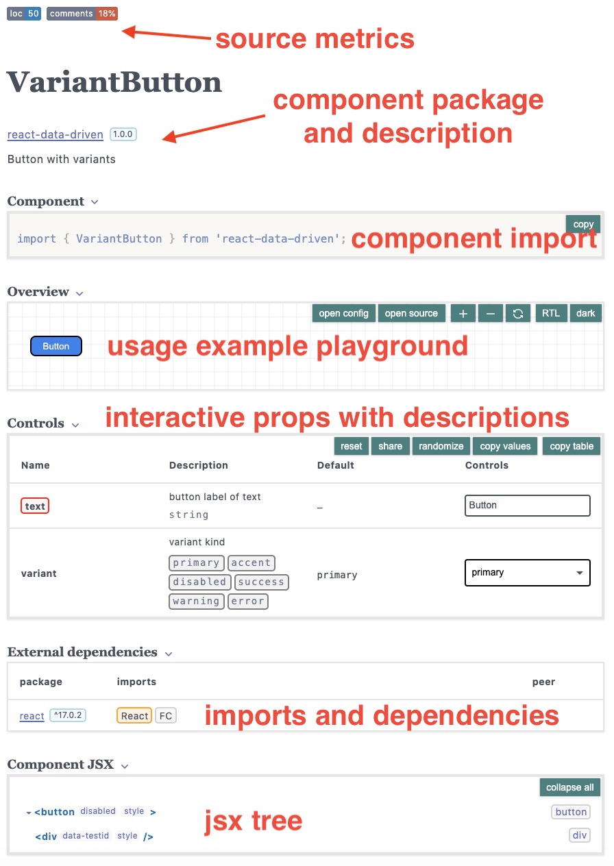 component documentation page
You can already see a lot of information on your new component that was automatically generated:
- Source code metrics (loc, comments, todos)
- Component description and package name
- Sample code for users to import your component
- A component playground, where you can see the source code
- Interactive props to play with your component and see the visual rendering
- Extenranl (and internal) dependecnies
- JSX rendering tree
the component-controls cc-cli package can be used to generate automatically tests and data for your react components
yarn add @component-controls/cc-cli --dev
add jest and typescript packages, since we will create our tests with typescript for this tutorial.
yarn add ts-jest @types/jest @testing-library/react --dev
jest can be configured in the project's
package.json or through a jest.config.js, or jest.config.ts files.package.json
"jest": {"preset": "ts-jest","globals": {"ts-jest": {"isolatedModules": true}}}
add scripts to generate the tests and run the tests
package.json
"scripts": {..."test:create": "cc-cli -w -g doc","test": "yarn jest"},
tsconfig.json
{"compilerOptions": {"esModuleInterop": true,"jsx": "react"}}
yarn test:create
this will execute the tests and create a snapshot file
yarn test
You can customize the cc-cli generated templates.
- Choose the target (cjs, esm, or ts)
package.json
"test:create": "cc-cli -w -g doc -f cjs",
- Choose test renderer (rtr, rtl, or enzyme)
package.json
"test:create": "cc-cli -w -g doc -r enzyme",
- Chose the template level
package.json
"test:create": "cc-cli -w -g store",
package.json
"test:create": "cc-cli -w -g story",
- Customize the generated tests
- install
@testing-library/jest-domcustom matchers
yarn add --dev @testing-library/jest-dom
- replace the generic snapshot test with custom matchers
src/components/VariantButton/VariantButton.test.tsx
...import '@testing-library/jest-dom';...it('custom test', () => {const { getByTestId, container } = render(rendered);expect(getByTestId("label")).toHaveTextContent("Button");expect(container.children[0]).toHaveStyle("background: #2F80ED");});
Starting the documentation site at this point should give you a set of test results:
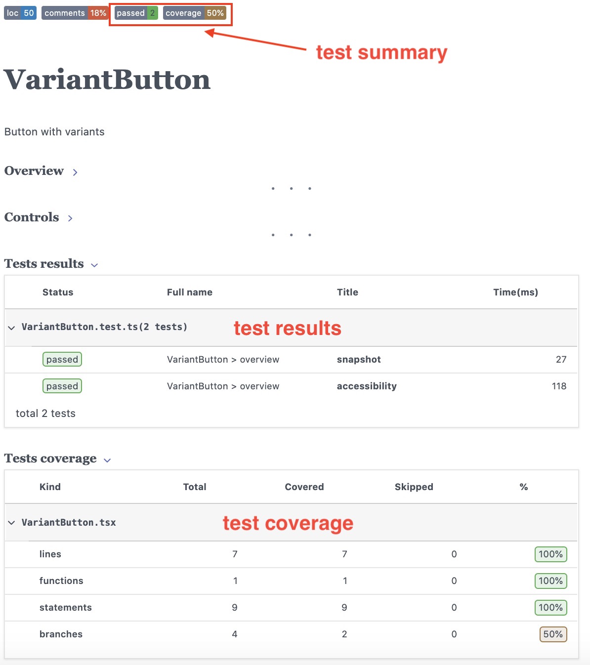 component tests page
You can notice the following test-related information
- Test summary (passed and failed), as well as the lowest coverage percentage
- A table with the snapshot and accessibility tests results
- A breakdown of the component files test coverage
From the coverage report, you can notice that only one of the branches was covered by our tests - in this case, we never tested for this condition
disabled={variant === 'disabled' ? true : undefined}.
We can correct this by adding a new example with the variant="disabled" property.src/components/VariantButton/VariantButton.docs.tsx
export const disabled: Example = () => (<VariantButton variant="disabled" text="Disabled" />);
The tests will be re-run and the branch coverage increase to a full 100%
The see the snapshot testing in effect, you can modify VariantButton component:
src/components/VariantButton/VariantButton.tsx
<div data-testid="label" style={{ padding: '15px 10px' }}>{text}</div>
The tests will be re-run automatically and the test page will now display an error to help you validate the introduced changes:
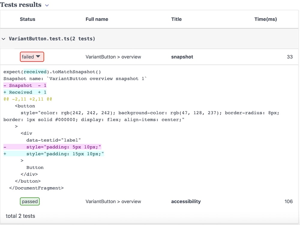 snapshot error diff
To fix the tests, you can either delete the snapshot file (this will automatically re-run the test and generate a new snapshot) or revert the change.
Data-driven testing is a testing method, where you create a single test and execute it multiple times by using a table that contains rows of data.
To create automatically data-driven testing data files, you can use cc-cli (with the
-d option and specify the number of rows to generate):package.json
"test:create": "cc-cli -w -g doc -d 5",
To achieve consistent data generation, you can specify the random generator seed with the
-s parameter:package.json
"test:create": "cc-cli -w -g doc -d 5 -s 1122334455",
you can now re-run the
test:create script to generate the data and update the test fileyarn test:create
Starting the documentation site will display a table with the data rows in the testing page:
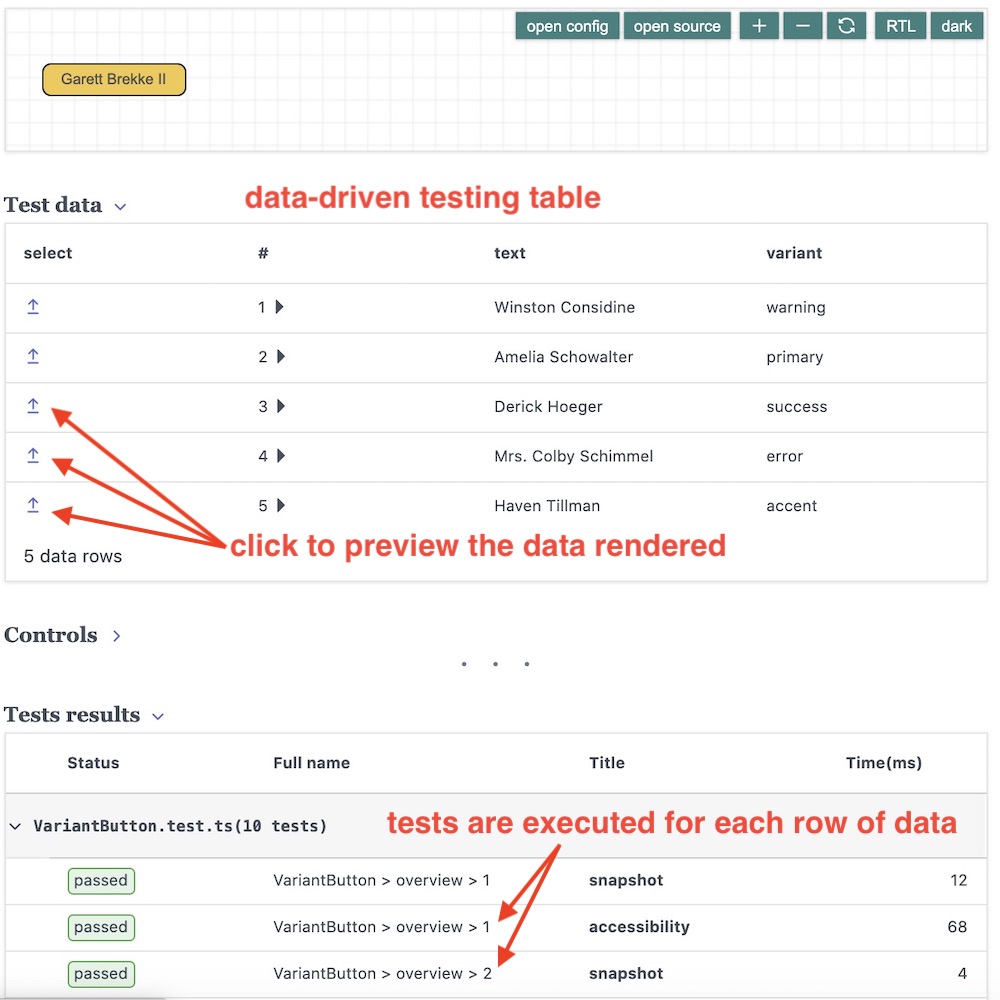 data-driven testing UI
You can manually edit the data - for example, change the generated random values, or rename a row id.
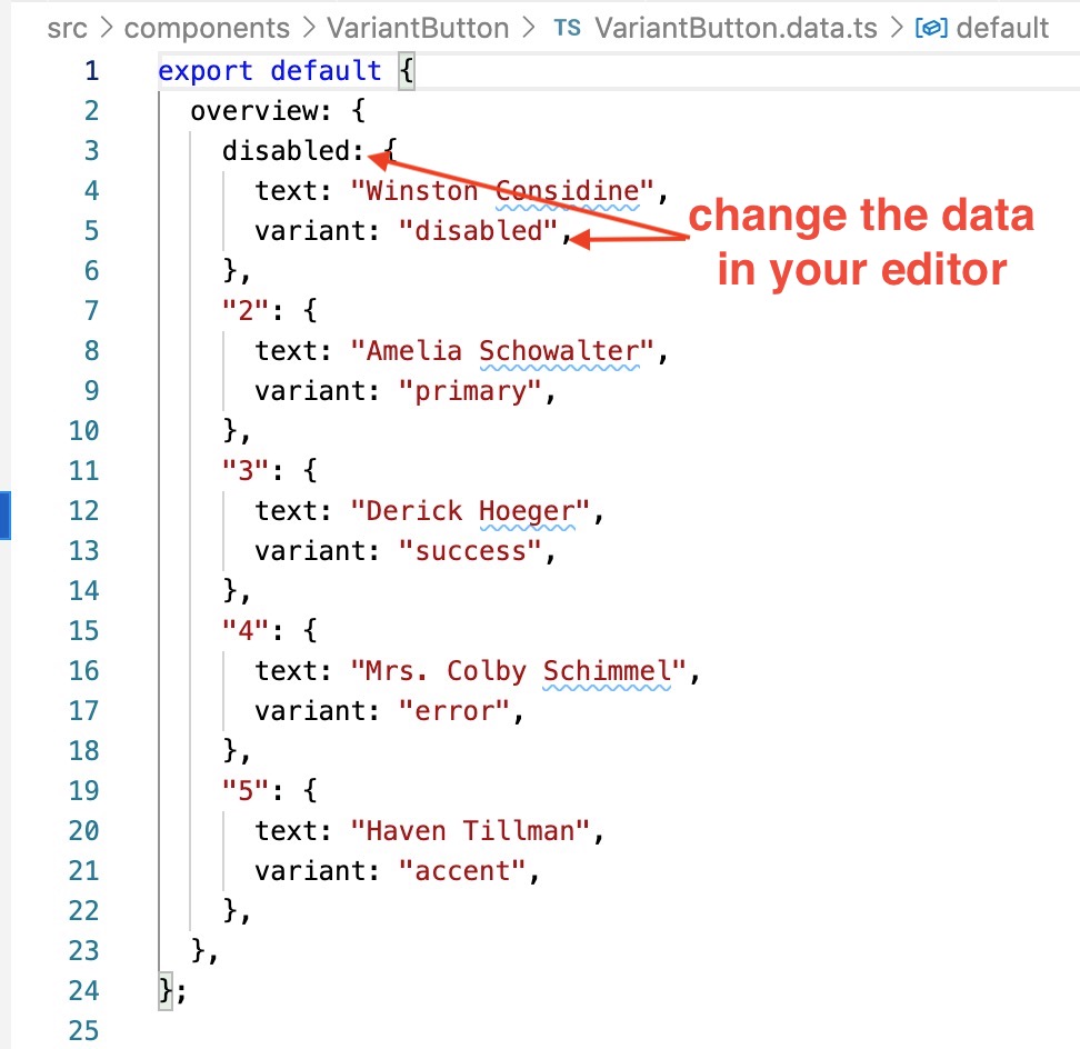 edit data in your editor
You can also use the randomize function in the controls table and then copy/paste the data into the data file.
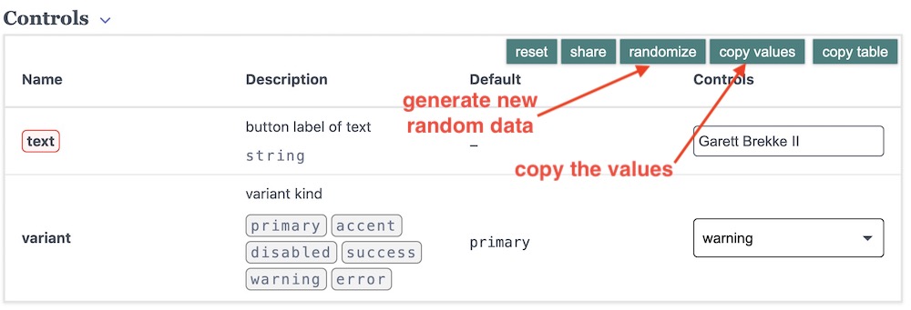 generate random data