Creating custom ESM pages
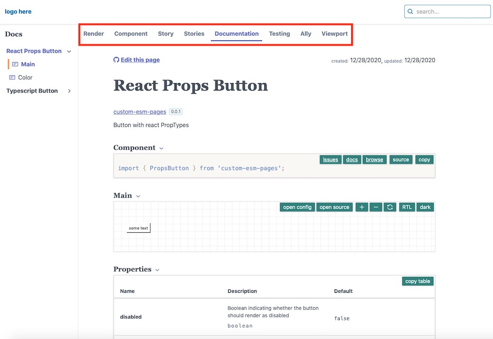
 custom esm page tabs
You can customize
component-controls in many ways, in this article we will show how you can add custom page tabs to your ESM documentation pages.The ESM page tabs are customizable by page type - where the default page type for your ESM files is
story.By default,
component-controls uses a page template (ClassicPage) that contains a good mixture of blocks to document your stories.You can find the source for the example custom esm pages
The page tabs can be customized in the buildtime configuration file of your project.
The following example will use two ESM page tabs - the default ClassicPage and a new TestingPage - this will be for all pages of type
story.config/buildtime.js
module.exports = {...pages: {story: {tabs: {page: '@component-controls/pages/ClassicPage',test: '@component-controls/pages/TestingPage',},},},};
You can customize various page props if you configure the page tab as an array. The following example uses a custom title, as well as empty 'containers' for the page:
.config/buildtime.js
module.exports = {...pages: {story: {tabs: {canvas: ["@component-controls/pages/CanvasPage",{ title: "Render", container: null, variant: "" },],page: '@component-controls/pages/ClassicPage',},},},};
You can also create custom pages and add them to a tab on the ESM documentation pages.
The following example creates a custom page that renders the current story in all the available themes. This can be useful to quickly preview any coloring/spacing issues for your components that are specific to a theme.
.config/ThemesPage.tsx
import React from 'react';import { TabConfiguration } from '@component-controls/core';import {Story,Description,} from '@component-controls/blocks';import { ThemeProvider } from 'theme-ui';import { BlockContainer } from '@component-controls/components';import { useThemes } from '../src/components/useThemes';const ThemesPage = () => {const themes = useThemes();return (<><Description />{themes.map(({ name, theme }) => (<BlockContainer key={`themed_component_${name}`} title={name} id={name} sx={{ mt: 0 }}><ThemeProvider theme={theme}><Story id="."sx={{ mb: 0, ...theme?.styles?.root }}/></ThemeProvider></BlockContainer>))}</>);}export default {title: 'Themes',component: ThemesPage} as TabConfiguration
and to add this page to your configuration
.config/buildtime.js
const { defaultBuildConfig } = require('@component-controls/core');module.exports = {...pages: {story: {tabs: {...defaultBuildConfig.pages.story.tabs,test: '@component-controls/pages/TestingPage',themes: require.resolve('./ThemesPage.tsx'),},},},};
The full sample project, documenting theme-ui is available for inspiration.