Migration from Storybook 6 - Storybook
The starting sample project was cloned from
The final project can be found here:
Install @component-controls/storybook
yarn add @component-controls/storybook -D
component-controls has two configuration files - one is used during build-time in a nodejs environment, the other is used during run-time in a browser environment.
The rough equivalents of Storybook for those two configuration files are
main.js and preview.(js|ts)Add the storybook extension to
main.js.storybook/main.js
module.exports = {stories: ['../src/**/*.stories.@(js|jsx|ts|tsx|mdx)'],addons: ['@storybook/addon-essentials','@storybook/preset-create-react-app','@component-controls/storybook',],};
At his point, you can start your documentation site
yarn storybook
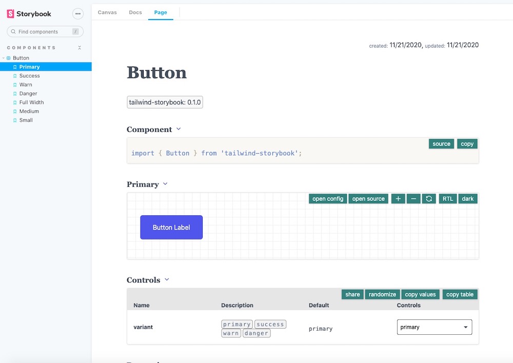
And a new documentation Page tab will be visible
 docs and page
component-controls allows adding fully customizable documentation pages to your documentation site.
yarn add @component-controls/axe-plugin @component-controls/viewport-plugin -D
You can create any custom page using
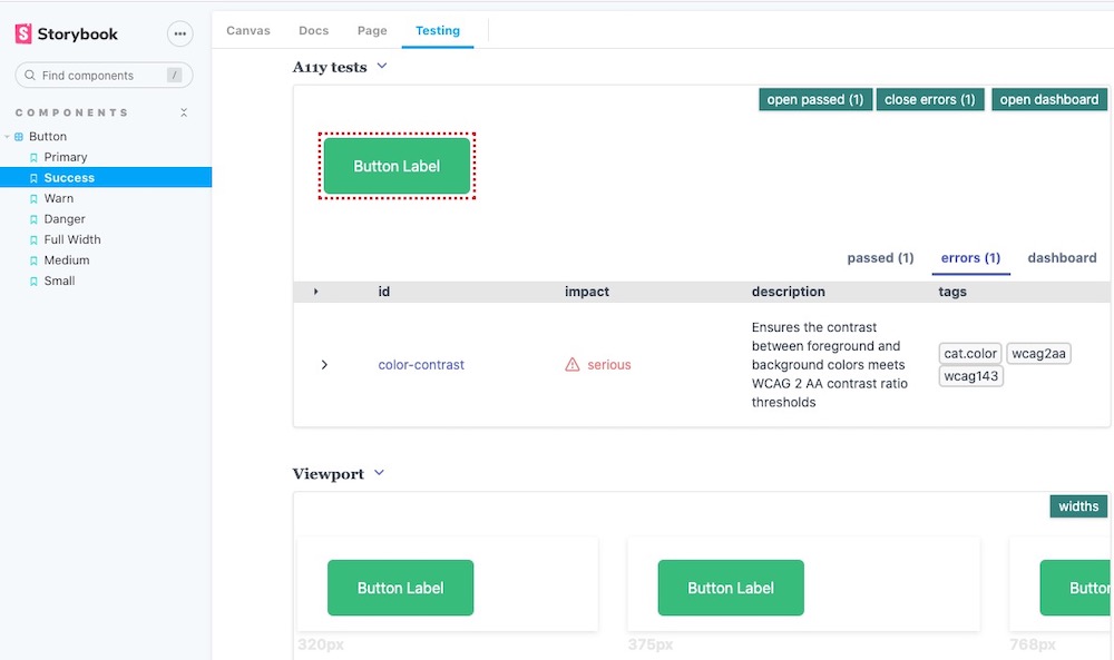
react and importing component-controls or external components. For this example we will create a Testing page that will contain the story description (if any), a playground to view the rendered story, a block with controls to edit properties of the current story as well as the installed axe-plugin and viewport-plugin for ally and mobile testing..storybook/testing-page.js
import React from 'react';import {Playground,PropsTable,Story,Description,} from '@component-controls/blocks';import { getControlsCount } from '@component-controls/core';import { useCurrentStory } from '@component-controls/store';import { AllyBlock } from '@component-controls/axe-plugin';import { ViewportBlock } from '@component-controls/viewport-plugin';import { DocsContainer } from '@component-controls/storybook/DocsContainer';const TestingPage = () => {const story = useCurrentStory();const controlsCount = getControlsCount(story?.controls);return (<><Description />{controlsCount > 0 && (<><Playground title="."><Story id="." /></Playground><PropsTable of="." title="Controls" visibility="controls" /></>)}<AllyBlock title="A11y tests" /><ViewportBlock title="Viewport" /></>);};export default {key: 'docs-test',title: 'Testing',render: ({ active }) => {return (<DocsContainer active={active}><TestingPage /></DocsContainer>);},};
Once the page is created, you will need to configure Storybook to load it as part of
@component-controls/storybook.storybook/main.js
module.exports = {stories: ['../src/**/*.stories.@(js|jsx|ts|tsx|mdx)'],addons: ['@storybook/addon-essentials','@storybook/preset-create-react-app',{name: '@component-controls/storybook',options: {pages: [require.resolve('@component-controls/storybook/full-page'), // this is the default documentation pagerequire.resolve('./testing-page'),],},},],};
The new Testing Page should now be visible
 testing page
The
@component-controls/cc-cli package is automatically creating jest snapshot tests from your existing stories. It has an easy to use command-line interface that we will use in this example but also offers a fully customizable API.yarn add @component-controls/cc-cli -D
We will launch the
cc-cli command-line tool to create automatically tests for all our existing stories.package.json
{"name": "tailwind-storybook-controls",..."scripts": {"start": "react-scripts start","build": "react-scripts build","test:create": "cc-cli -c ./.config -o tests -t stories.test.ts -n components -f ts","test": "yarn jest""eject": "react-scripts eject",...},...}
yarn test
Running the
test:create script test will a tests file stories.test.ts (typecript format) in the tests folder.After running the tests, you should have a file
tests/__snapshots__/stories.test.js.snap, with snapshots like this one:tests/__snapshots__/stories.test.js.snap
exports[`Components/Button Primary 1`] = `<DocumentFragment><buttonclass="rounded-md focus:outline-none focus:shadow-outline bg-primary-500 text-white hover:bg-primary-600 py-4 px-8"type="button">Button Label</button></DocumentFragment>`;
At this point, you are ready to remove the Storybook docs page, and as a second step relegate all the instrumenting to component-controls
We can now remove
@storybook/addon-essentials from the main.js configuration file - this will take out the Docs tab from the user interface, but will also take out the MDX instrumenting..storybook/main.js
module.exports = {stories: ['../src/**/*.stories.@(js|jsx|ts|tsx|mdx)'],addons: ['@storybook/preset-create-react-app',{name: '@component-controls/storybook',options: {pages: [require.resolve('@component-controls/storybook/full-page'), // this is the default documentation oagerequire.resolve('./testing-page'),],},},],};
If you have MDX documents in your documentation, we will need to add a custom
webpack configration to @component-controls/storybook.storybook/main.js
module.exports = {stories: ['../src/**/*.stories.@(js|jsx|ts|tsx|mdx)'],addons: [{name: '@component-controls/storybook',options: {pages: [require.resolve('@component-controls/storybook/full-page'), // this is the default documentation oagerequire.resolve('./testing-page'),],webpack: ['instrument', 'react-docgen-typescript'],},},],};